So you've started a real estate business, and you're building up your clientele. Real estate business cards are a must.

While every card will include your company’s name and contact info, a well-designed card will help you stand out and secure business. A poorly made business card will likely end up in the trash.
So how can you make a professional, unique real estate business card? Explore these examples for inspiration.
11 Real Estate Business Cards to Inspire Your Own
Business cards are an easy way to share your contact information. The best real estate business cards feature sleek branding, easy-to-read fonts, and effective use of color. Each of these business cards creatively leverages design. Let’s dive in.
1. Westend Homes

What we like: This Westend Homes business card effectively uses color theory in its design. Blue and yellow are complementary colors. The dark blue background draws attention to the yellow-colored company name and realtor name.
This business card also has a QR code that allows potential clients to visit the business’ website or listings.
Right beside the QR code is the tagline, “Home is the nicest world there is!” Taglines are a great way to add a personal touch to business cards.
2. Forefront Real Estate
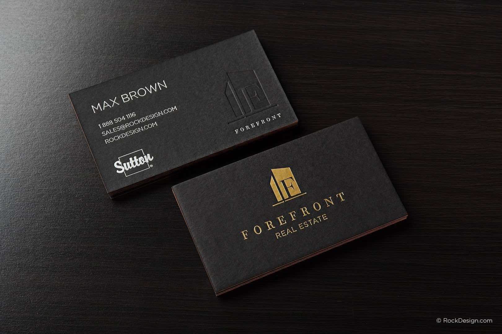
The combination of a black background and gold foiling makes the Forefront Real Estate branding stand out. The use of gold also signals luxury and elegance.
While the contact information on the back of the card is straightforward, the embossed logo makes the card look modern.
Pro tip: Focus on a few design elements that catch the eye. Keep the rest of the card sleek and simple.
3. One Five Eight Property
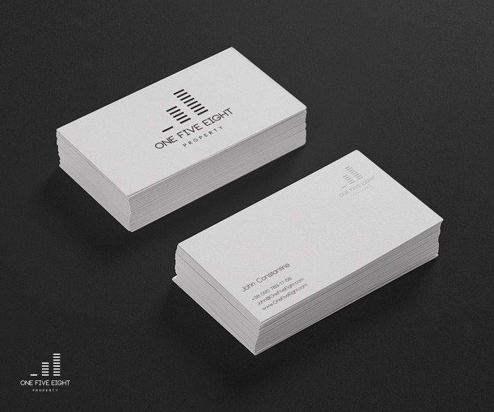
This business card has a minimalist design, and the designer makes the most of simplicity.
Black and white create contrast on the card. Meanwhile, the logo uses basic shapes to represent the name of the company. Even the fonts used are simple and do not clutter the card. Overall, the card looks cohesive. No one element distracts from the others.
What we like: This design makes it easy for people to understand the information on the card right away.
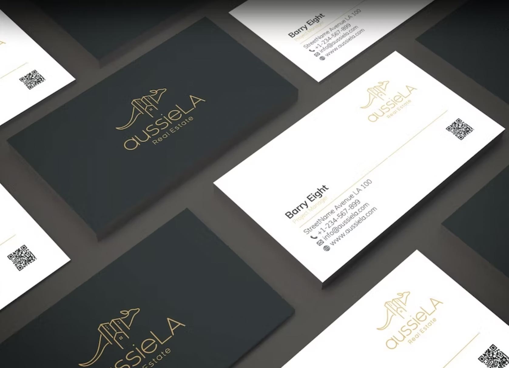
4. aussieLA Real Estate
The main feature of this business card is the golden logo. As mentioned earlier, gold foiling — especially when set against dark backgrounds — is stunning.
The kangaroo logo itself is memorable. Before even looking at the contact information, people who see this business card may be able to guess from the logo that the company is located in Australia.
Pro tip: Logos are not an afterthought. Your logo should communicate information about your business.
5. Century 21
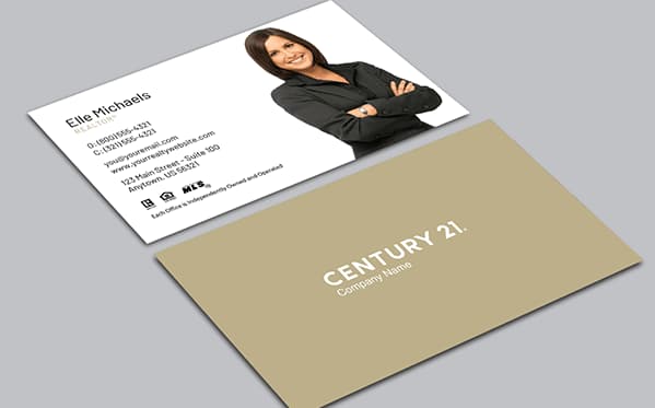
This card makes use of simple colors and sleek fonts, allowing the eye to focus on the photo of the realtor. The photo itself is high resolution. The agent’s dark suit stands out against the white cardstock.
Pro tip: Adding a photo of yourself to your business card will help potential clients put a face to the name. Not only will this make it easier for prospects to approach you, but it'll also help them remember who you are long after they've worked with you.
6. Berkshire Hathaway
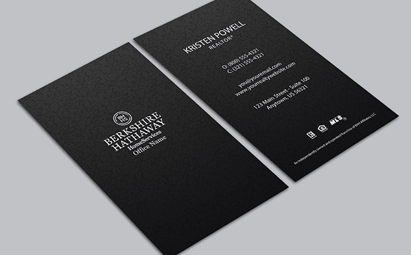
What we like: This Berkshire Hathaway card has a vertical layout instead of a traditional horizontal design. This one, small change makes the card stand out in a pile.
The white font with the realtor’s contact information pops on the dark background. The jet-black cardstock makes company branding the focal point.
7. Maze Real Estate
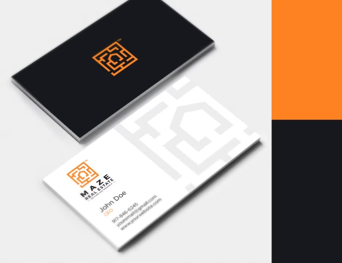
Pro tip: Incorporate a bold color in your business card design. The orange logo on the front of the card catches the eye — especially with its stark contrast over the black background.
On the back of the card, the dark font is easy to read on the white cardstock. However, orange is still the boldest color, drawing attention to the company’s logo.
8. Jennifer J. Janzen-Botts
What we like: This unique business card makes use of bold fonts. On the logo, the realtor's name is spelled out in full, showing creativity. On the back of the card, she uses only her first name. This is a great way to connect with prospects on a personal level.
The card also makes use of color. Rose pink is warm and inviting, indicating that the realtor offers a luxury service.
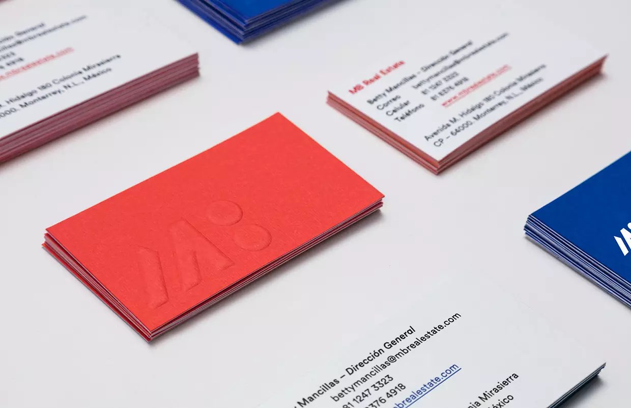
9. MB Real Estate
Rather than printing its logo on cardstock, MB Real Estate chose to have its business cards embossed. The back of the card itself is simple, but the red text gives it a pop of color.
Pro tip: Embossing can add texture to your business cards in a way that is both elegant and modern.
10. Vincer
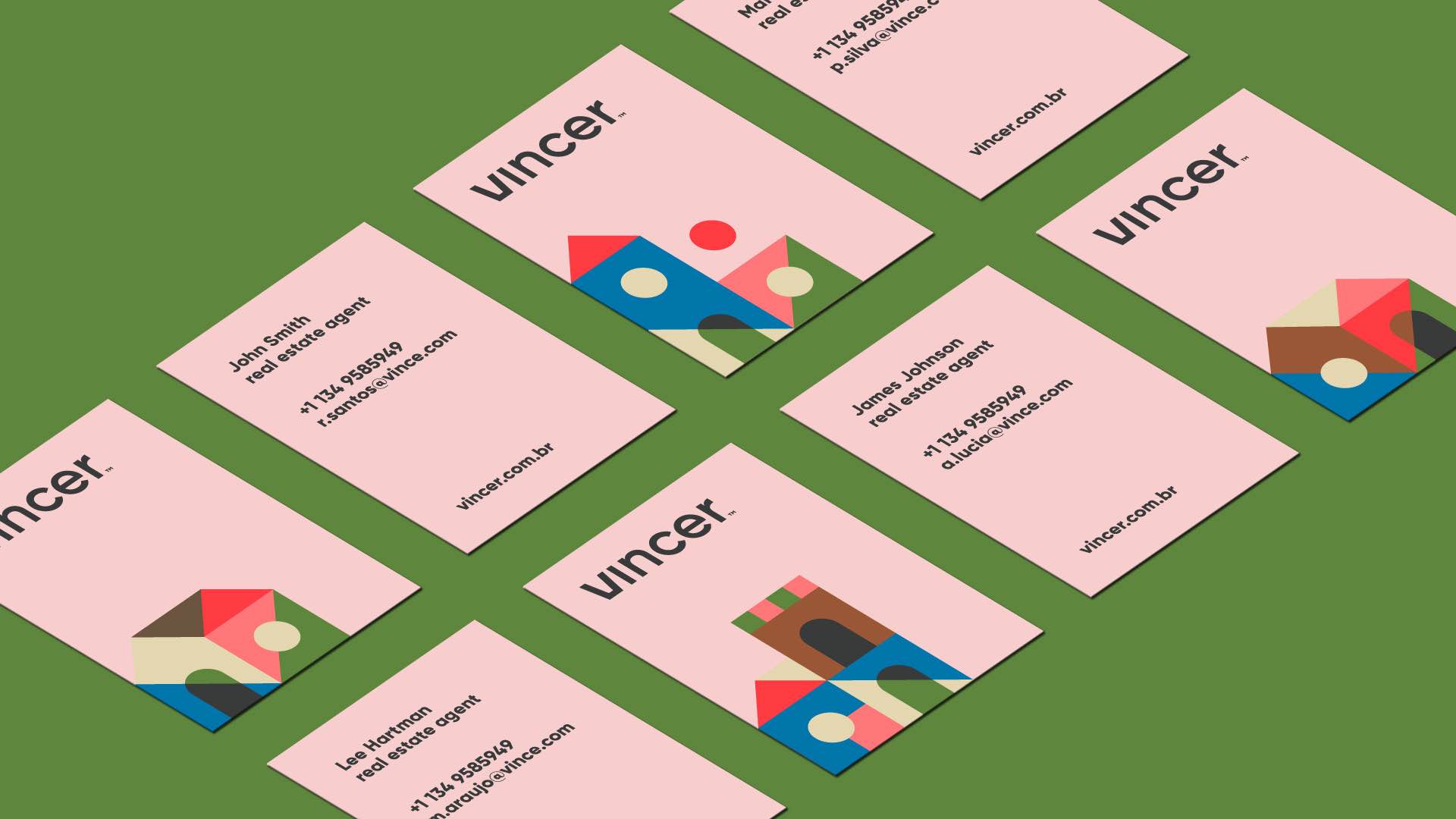
What we like: Instead of opting for photo-realistic buildings or a basic silhouette logo, Vincer opted for a more playful design. Colorful geometric shapes create buildings. This cubist imagery will not soon be forgotten.
The use of a pink background is also unique. This pastel shade will stand out in a pile. Meanwhile, the contrasting black text makes the card easy to read.
11. Beehive Realty Group
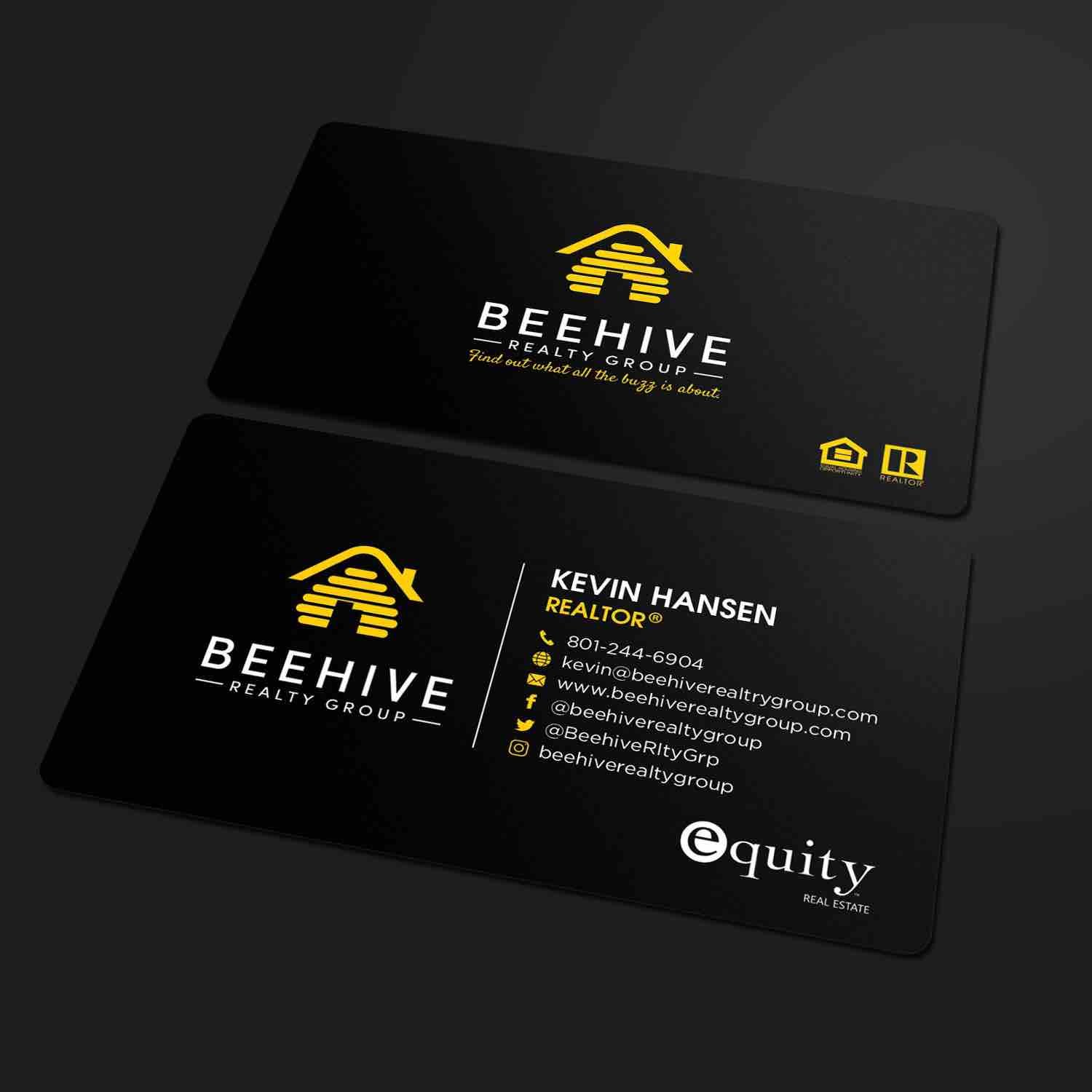
This real estate business card leans into iconic bee imagery. The logo is shaped like a hive, and the card contrasts black and yellow — two colors associated with bees. The bright yellow font catches the reader's attention.
What we like: The yellow icons that indicate each way to contact the realtor are a great touch. These symbols help prospects easily find information.
Looking for ways to use these best practices? Watch the video below for advice on creating a unique real estate business card.
Real Estate Business Card Mistakes to Avoid
1. Keep all imagery related to your business.
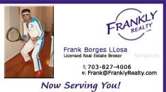
At first glance, you may expect this business card to be for tennis lessons. A prospect looking for a realtor may throw away the card after a quick glance. While your interests may help you connect with clients on a personal level, you don’t need to showcase your hobbies on your business card.
Remember: If you want to put your photo on your business card, make sure it is high-quality and professional.
2. Avoid visual clutter.
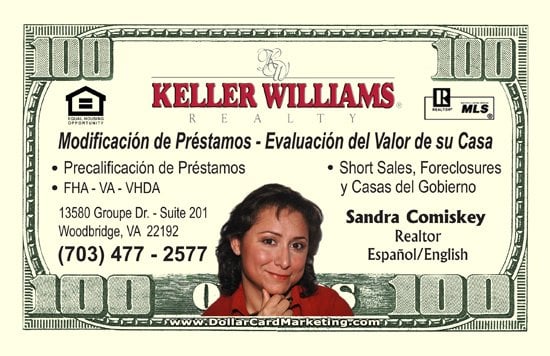
This business card has too many design elements and a confusing layout. The hundred-dollar bill imagery has little to do with real estate. Instead, it distracts viewers from the realtor’s contact information.
Pro tip: In the world of graphic design, less is more. Too many design elements can make your business card look cluttered. If prospects have to hunt for your contact information, they’re less likely to reach out.
3. Skip the fake background.
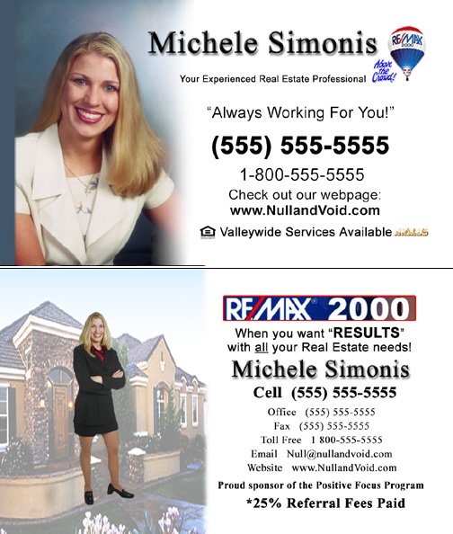
You may be tempted to show off the variety of houses you sell on your business card. While this idea can work, virtual backgrounds often look tacky and unprofessional.
Pro tip: Avoid photoshopping a picture of yourself on top of a virtual background. Instead, choose between a picture of a house and a photo of yourself. If you do feature an image, keep the rest of your business card simple.
Real Estate Quotes for Business Cards
Adding a tagline or a quote to your business card is another way to stand out. Here are a few quotes to choose from. For even more inspiration, read these real estate quotes.
- “To be successful in real estate, you must always and consistently put your client’s best interests first. When you do, your personal needs will be realized beyond your greatest expectations.” -Anthony Hitt
- “Expansion always, in all ways.” -Ryan Serhant
- “Don't wait to buy real estate. Buy real estate and wait.” -Will Rogers
- “In the real estate business you learn more about people, and you learn more about community issues, you learn more about life, you learn more about the impact of government, probably more than any other profession that I know of.” -Johnny Isakson
- “There have been few things in my life which have had a more genial effect on my mind than the possession of a piece of land.” -Harriet Martineau
- “Real estate is an imperishable asset, ever increasing in value. It is the most solid security that human ingenuity has devised. It is the basis of all security and about the only indestructible security.” -Russell Sage
- “Whether you're an obstetrician or a third-grade teacher or a real estate agent, you know when you're doing good work. You're passionate about it.” -Susan Isaacs
- “Buyers decide in the first eight seconds of seeing a home if they're interested in buying it. Get out of your car, walk in their shoes, and see what they see within the first eight seconds.” -Barbara Corcoran
- “In a crowded marketplace, fitting in is a failure. In a busy marketplace, not standing out is the same as being invisible.” -Seth Godin
With a great business card design, you'll be ready to network with potential clients. To learn more about growing your real estate business, check out these real estate marketing ideas next.
Real-estate
-Sep-24-2022-01-44-12-10-AM.png)
![19 Impressive Examples of Realtor Bios That Win Clients [Template]](https://2406023.fs1.hubspotusercontent-na1.net/hubfs/2406023/Imported_Blog_Media/real-estate-agent-bios-FI%20(1).jpg)


.jpg)
